흰배경에 업로드한 사진이 콜라주처럼 배치, 자동으로 손글씨 타이포까지 적용되는 프롬프트 에디토리얼 스타일 포스터
작성자 관리자 · 게시일 2026. 5. 15.

결과물 분위기를 먼저 확인해 보세요.
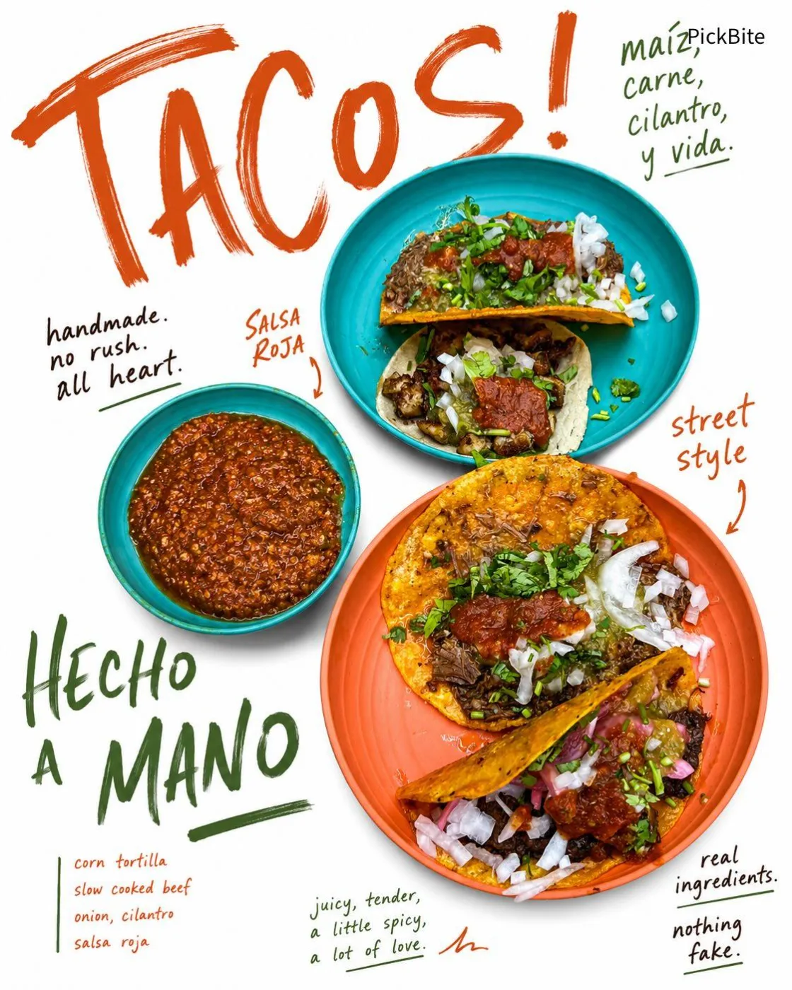
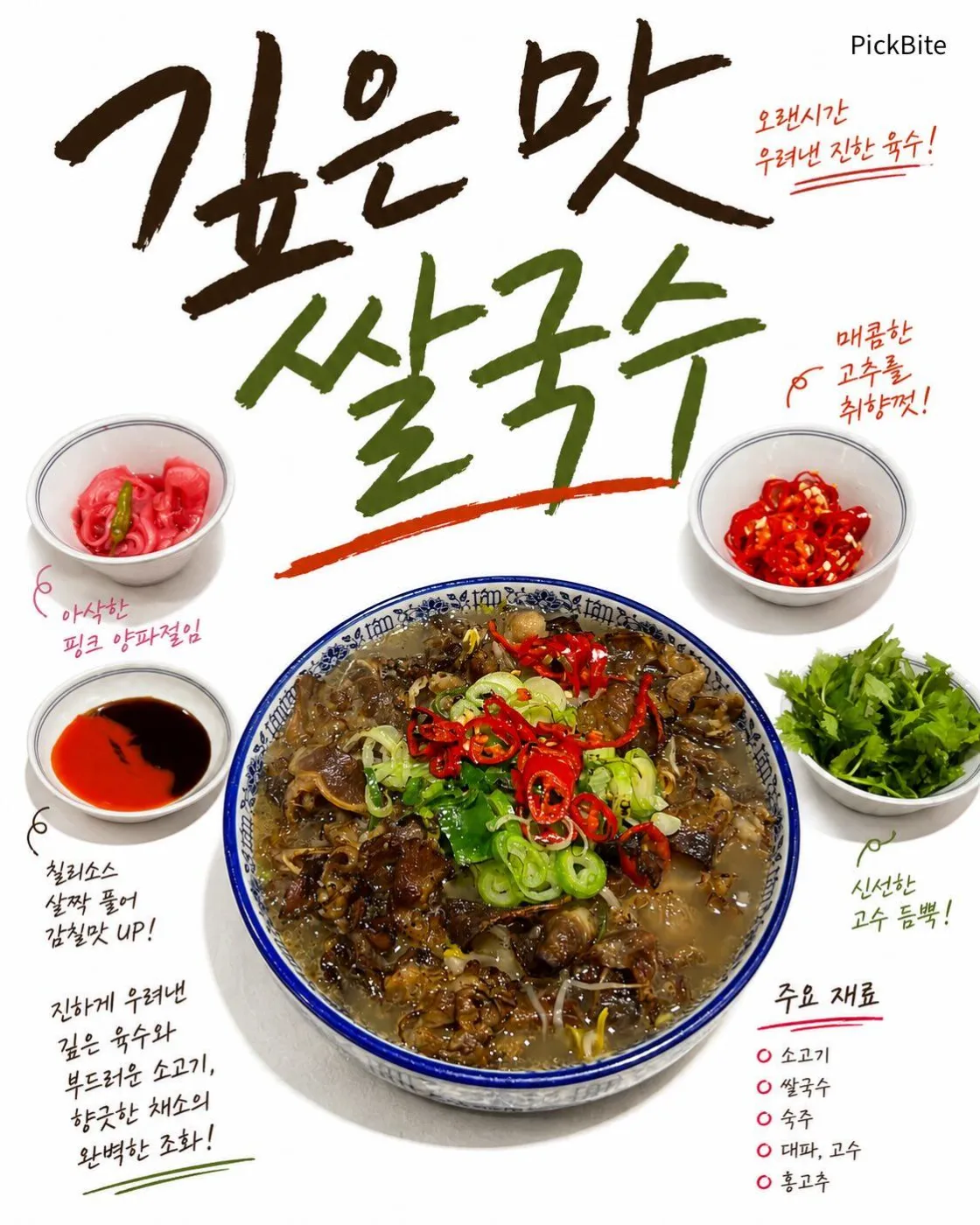
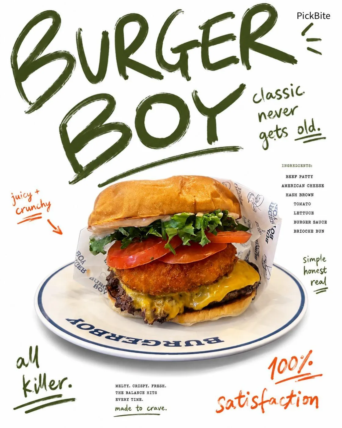
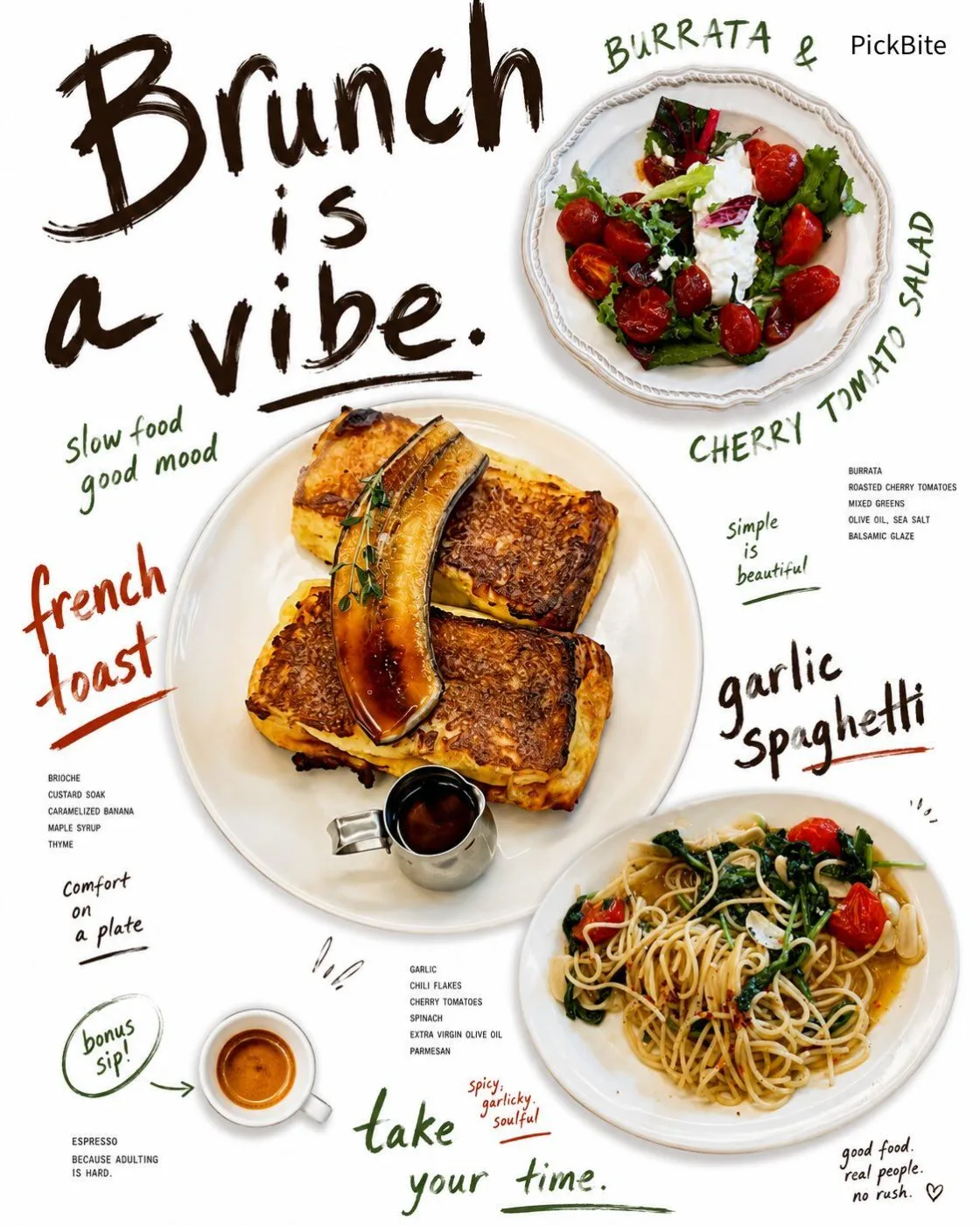
퀄리티가 높은 프롬프트로 바로 카페,식당, 매장 포스터, SNS홍보포스터, 광고용 이미지로 활용가능합니다. 한글로 요청하시면 손글씨가 한글로 적용됩니다.
추가 준비물 없음
포스터 안에서 바로 이어서 볼 수 있는 프롬프트입니다.
같은 AI 도구에 맞춰 바로 이어서 활용할 수 있는 프롬프트입니다.
같은 주제의 프롬프트와 활용 가이드로 바로 이어서 탐색할 수 있습니다.
Create a 4:5 vertical food editorial poster on a pure white background using editorial-style food photography.

For multi-item food photos, arrange the food elements like a handmade collage.

For single-item food photos, create a minimal hero-centered editorial composition using ONLY the single uploaded food item.

If the uploaded image contains only one food item, do NOT generate additional food items, duplicate versions, alternate angles, sliced variations, combo meals, drinks, or side dishes.

Maintain a strict one-item composition for single-food uploads.

The composition must feel like a modern fashion-editorial food poster, not a restaurant menu and not a clean commercial advertisement.

Use large authentic handwritten marker typography across the layout, strongly inspired by real human brush pen writing and rough café poster doodles. The handwriting must feel genuinely human:
- uneven baseline
- inconsistent letter sizing
- irregular spacing
- messy marker strokes
- imperfect pressure variation
- slightly rushed handwritten energy
- organic wobble and asymmetry
- rough brush marker texture
- NOT clean typography
- NOT polished font design
- NOT vector lettering
- NOT calligraphy
- NOT graffiti
- NOT cute doodles

The handwritten text should interact naturally with the food placement like an editorial collage layout, with some text wrapping around food items and some words oversized dramatically.

Add tiny imperfect editorial annotation text near menu items using condensed small typography mixed with handwritten notes. The small text should feel slightly raw and intentionally imperfect, similar to indie café posters or experimental food zines.

The poster must contain:
- food items derived ONLY from the uploaded image
- preserve the original number and type of visible dishes and drinks
- optional rearrangement or scaling of existing food elements ONLY
- NO newly invented menu items or side dishes
- expressive handwritten titles
- tiny ingredient descriptions
- generous empty white space
- asymmetrical visual balance
- playful but controlled composition

Do not expand the menu concept beyond the uploaded image.

Food images must be:
- realistic commercial food photography
- editorial-style intelligent cutout composition
- lightly grounded with minimal soft shadow
- preserve plates or serving ware for plated dishes, salads, pasta, and foods with incomplete or organic silhouettes
- remove serving objects for foods with naturally strong standalone silhouettes such as sandwiches, burgers, pastries, cookies, donuts, pizza slices, bottled drinks, or canned beverages
- prioritize silhouette cohesion and artistic composition over strict object isolation
- preserve only food-related serving elements that meaningfully contribute to the visual composition, food identity, plating structure, or editorial silhouette
- remove incidental dining props such as disposable cups, water cups, napkins, trays, utensils, tableware extras, and background dining objects unless they are visually essential to the featured food presentation
- NOT inside a restaurant environment
- NOT on tables
- NOT in kitchen scenes

Very important:
Automatically derive the typography color palette from the dominant colors of the food itself.
Examples:
- green herbs or pesto → green handwritten typography
- tomato or pepperoni → warm red/orange accents
- coffee or roasted foods → dark espresso/brown tones
- monochrome foods → black handwritten typography
The color adaptation must feel artistic and naturally harmonized with the ingredients.

The overall aesthetic should feel like:
fashion editorial food poster,
handmade café campaign artwork,
experimental artisanal bakery branding,
raw modern food collage design.

Maintain strong visual hierarchy:
- oversized handwritten headline
- medium handwritten labels
- tiny descriptive annotations
- large food cutouts with varied scale

The final image must feel intentionally imperfect, artistic, premium, playful, raw, and human-made.

Avoid:
clean corporate menu design,
template layouts,
perfect alignment,
stock advertisement look,
minimal sans-serif branding,
AI-generated decorative backgrounds,
fake vector handwriting,
overdesigned graphic elements,
tabletop restaurant scenes,
chalkboard menu style.

Aspect ratio 4:5


